Creating a responsive pop-up gallery is one of the best ways to improve user engagement on a website. Whether you are showcasing products, portfolio images, event photos, or creative work, a pop-up gallery gives visitors a smooth and professional viewing experience without leaving the current page. Today, websites need to be mobile-friendly, fast-loading, and visually attractive, which is why responsive pop-up galleries have become an essential design element.
Many businesses, including creative brands and agencies like Skyrazone, use responsive galleries to create a modern user experience that keeps visitors engaged longer. As a company offering website development, web design, SEO services, branding, and digital marketing solutions, Skyrazone focuses on creating user-friendly and visually attractive websites for businesses. If you are planning to improve your website’s visual presentation, this guide will help you create a responsive pop-up gallery step by step.
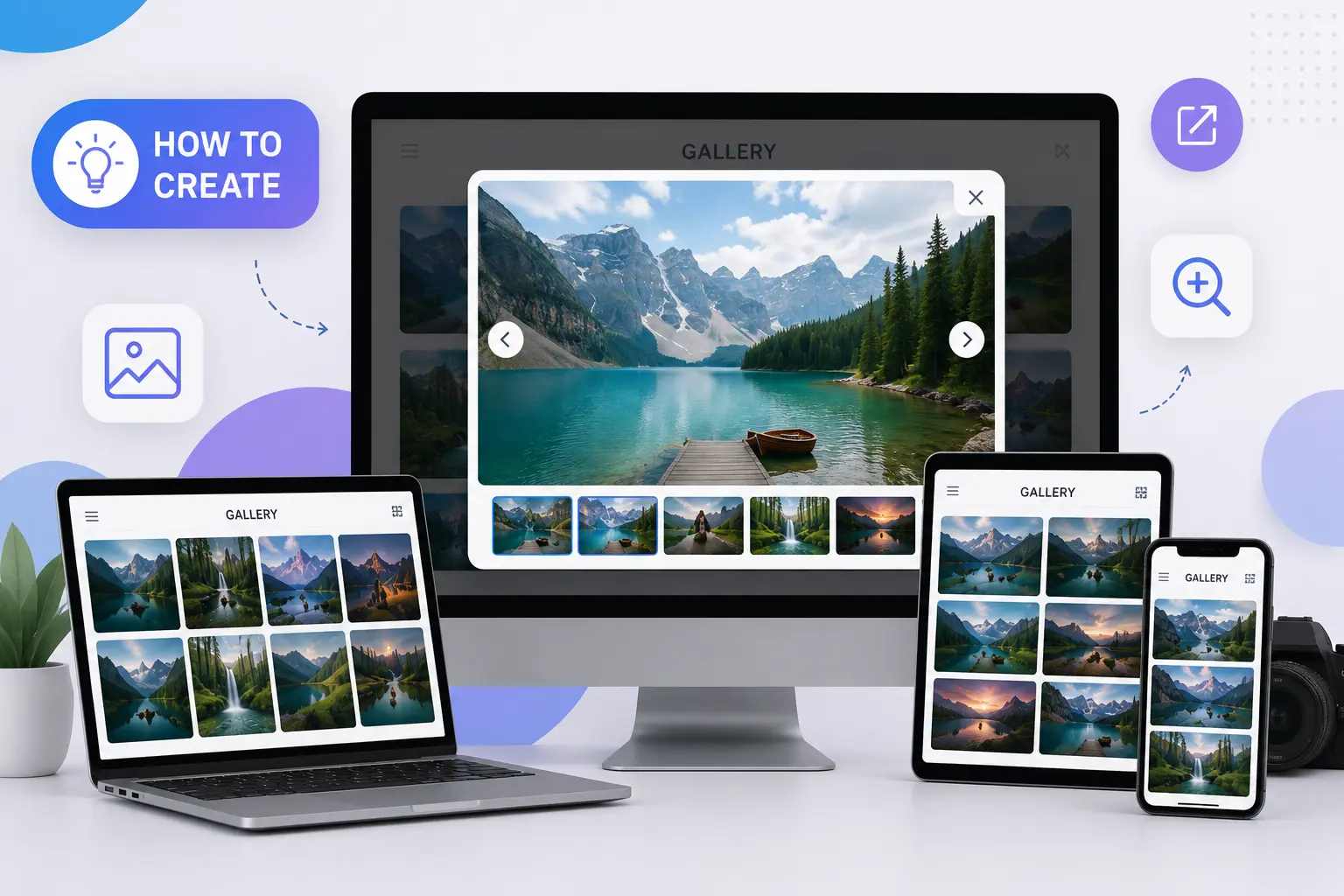
What Is a Responsive Popup Gallery?
A responsive pop-up gallery is an image gallery that automatically adjusts to different screen sizes while allowing users to open images in a pop-up or lightbox view. Instead of redirecting users to another page, the image opens in an overlay window where they can easily view, zoom in on, or navigate through multiple images.
The biggest advantage of responsive pop-up galleries is their compatibility across devices. Whether someone visits your website from a desktop, tablet, or smartphone, the gallery adapts smoothly to the screen size.
Why Responsive Galleries Matter
Modern users expect websites to be visually appealing and easy to navigate. A poorly designed image section can make a website feel outdated. Responsive pop-up galleries solve this problem by offering:
- Better user experience
- Faster image viewing
- Mobile-friendly interaction
- Improved website appearance
- Higher engagement rates
- Professional presentation of products or services
Businesses working with a digital marketing agency in Calicut often focus on improving website interaction because visual design directly affects user trust and conversions. Services like responsive website development, UI/UX design, SEO optimization, and custom web solutions help businesses create a stronger online presence.
Step 1: Plan Your Gallery Layout
Before creating the gallery, decide how you want it to look. Think about the number of images, whether you need categories, and how users should interact with the gallery. A clean grid layout usually works best because it looks organized and professional on all screen sizes.
Step 2: Make It Responsive
Responsiveness is the most important part of a pop-up gallery. The gallery should automatically adjust to the screen size so users can comfortably view images on mobile devices, tablets, and desktops.
A responsive gallery creates a smoother browsing experience and reduces frustration for users. Clean spacing, balanced image sizes, and fast loading speed all contribute to better website performance.
Step 3: Add Popup Functionality
The pop-up feature allows users to click on an image and view it in a larger format without leaving the page. This improves engagement because visitors can explore images more comfortably.
You can also add features like:
- Image navigation arrows
- Zoom functionality
- Swipe support for mobile users
- Smooth transition effects
- Dark background overlay
These additions make the gallery feel modern and professional.
Step 4: Optimize Images for Better Performance
Large image files can slow down a website, so image optimization is important. Always compress images before uploading them and use modern formats that maintain quality while reducing file size.
Fast-loading websites create a better user experience and also help improve search engine performance. Professional web development services, responsive design solutions, and website optimization strategies play an important role in improving website quality and customer engagement. This is why many businesses prefer working with experts like Skyrazone when improving website design and speed optimization.
Step 5: Test the Gallery on All Devices
Before publishing the gallery, test it on different devices and browsers. Make sure the pop-up works smoothly on smartphones, tablets, laptops, and desktop screens.
At Skyrazone, responsive design, website development, SEO services, and user-friendly layouts are considered important parts of modern digital growth because they help businesses create a more engaging online presence and improve customer interaction.
Common Mistakes to Avoid
Many websites make simple mistakes while creating pop-up galleries. Some common issues include:
- Using oversized images
- Ignoring mobile responsiveness
- Adding too many effects
- Cluttered gallery layouts
- Slow-loading elements
Keeping the design simple and clean usually delivers the best results.
Final Thoughts
A responsive pop-up gallery is more than just a visual feature. It improves user engagement, enhances website appearance, and creates a smoother browsing experience for visitors. With proper HTML structure, responsive CSS, optimized images, and simple JavaScript functionality, anyone can create an attractive pop-up gallery for their website.
As websites continue to become more interactive and mobile-focused, responsive design elements are no longer optional. Businesses that invest in better user experience often see improved engagement and stronger online performance.
Whether you are building a portfolio site, business website, or eCommerce platform, implementing a responsive pop-up gallery is a smart step toward a more professional digital presence. Businesses looking for website development, branding, SEO services, social media marketing, and digital marketing support can benefit from modern responsive design techniques.